
The New York City Subway system is an old rapid transit system, which is the source for many of the issues it faces, however it is also responsible for much of it distinctive character. Much of the stations in the system are either over or approaching 100 years old, a different time when greater detail was focused on the aesthetics of the architecture of public spaces and infrastructure. One of the most distinctive features within the New York City Subway systems is its mosaic tile work. What’s even more interesting is the story that this tile work has to tell.
The operation of the system has a complicated history, which is worthy of its own post in the future, but lets just say that in the past, before a single agency operated it, there were three separate companies operating their own lines throughout the city. The Brooklyn-Manhattan Transit Corporation (BMT), Interborough Rapid Transit (IRT), and the Independent Subway System (IND) all competed in servicing the passengers of the city’s boroughs. Each company has their own style of tile work that was implemented in the stations.
IRT Style
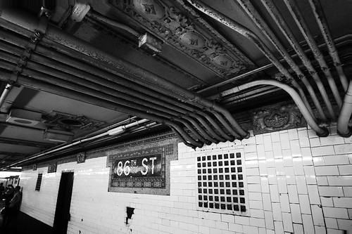
This is from the 86th Street Station on the Seventh Avenue-Broadway Line (Manhattan, 1 train). I fully admit, I indulged myself a little in the composition of this photo, but I felt only a wide angle photo would tell the complete story here. Much like the IND style, the station name is plainly identified within a mosaic. Unlike the IND style however, is the use of frieze around it and as a border. The older the station, more of this is used. This station was opened in 1904 and most of the original tile was removed in renovation years ago, this small section still exists.
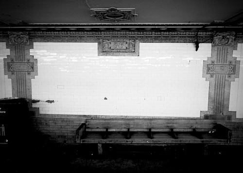
More of the station featured above, showing a more human perspective.
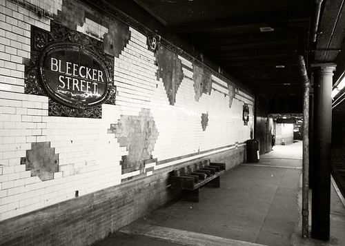
The Bleecker Street station on the Lexington Avenue Line (Manhattan, 6 Train) uses faience tablets to identify the station name. Like the previous station, much of the original work has been removed, by a few remain preserved.
IND STYLE
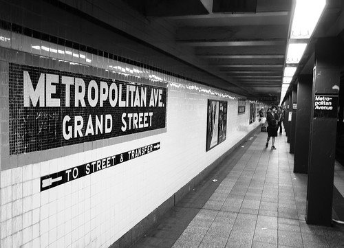
The Metropolitan Avenue Station on the Crosstown Line (Brooklyn, G Train) features a very standard form of tile work featuring plain lettering that is used widely on the old IND lines. The IND lines tend to be newer than the IRT and BMT lines and the style and the tile work tend to have a more streamlined look.
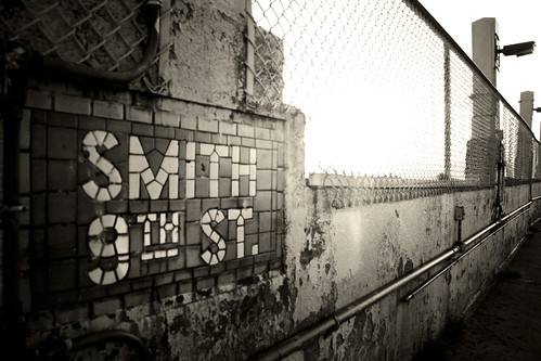
This work is a little more unique and is located on the Smith-9th station on the Culver Viaduct (Brooklyn, G and F Trains). This station (and the viaduct as a whole) is undergoing renovation, and I hope this remains untouched.
Many station also use individual letter tiling to identify the station. Carries much less prestige, but hey its easier to maintain I guess…The modern attitude of how infrastructure is treated.
BMT Style
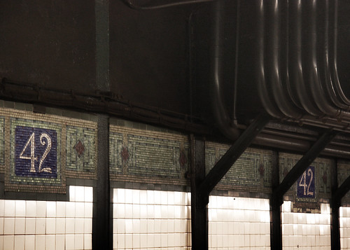
The tile work in BMT stations tend to be a little more intricate than IND tile work and use monogram frieze work. This work was taken from the 42nd-Time Square station on the Broadway Line (Manhattan, N, Q, R Trains).
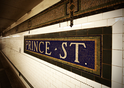
Taken from the Prince Street Station on the Broadway Line (Manhattan, N and R Trains), demonstrating a BMT Style name tablet.
‘Modern Style’
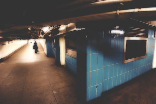
This tile work is typical in stations that have been renovated or relatively new stations built in the ‘60s and ‘70s. Many stations in Brooklyn use this light blue tile, such as Court Street Station (R Train) (Pictured). Many other stations use similar tile in that 1960’w rusty-red color, such as the Lexington Avenue-63rd Street (Manhattan, F Train) and 125th Street Station (Manhattan, A,B,C,D Trains). Others use an off white, such as the 57th Street Station (Manhattan, F Train).
No comments:
Post a Comment